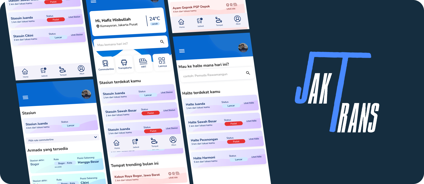
JakTrans - Public Transportation App

JAKTRANS

Simplifying Jakarta's Public Transportation Experience

The Challenge

Imagine this: You're standing at a bus stop in Jakarta, phone in hand, trying to figure out which bus to take, when it'll arrive, and how to connect to the next line. Sound familiar?

This case study explores how I designed a unified digital platform for Jakarta's public transportation users—bringing together schedules, routes, and real-time vehicle locations into one seamless experience. The goal? To transform the daily commute from a stressful puzzle into a smooth, confident journey for millions of Jakarta residents and visitors.

Meet JakTrans

"All your travel needs in Jakarta, unified in one place"

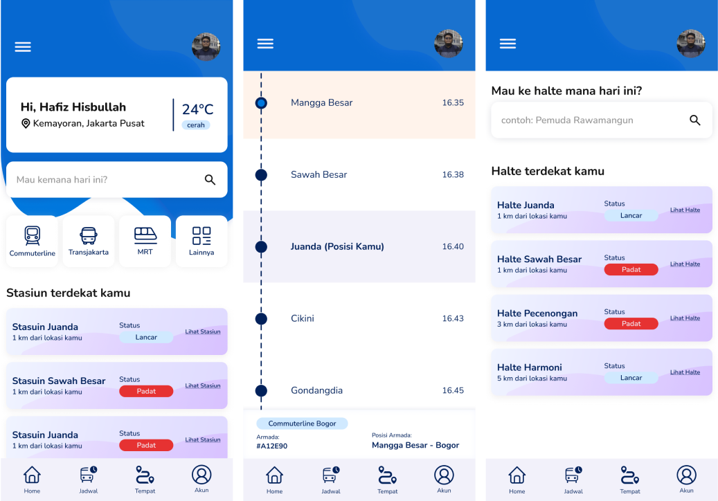
JakTrans brings everything you need for navigating Jakarta's public transportation into a single, intuitive app. No more juggling multiple apps or wondering which route to take. Routes, schedules, vehicle types, real-time tracking—it's all here, ready when you are.

⏱️ Duration
16 Weeks
👥 The Team
Muhammad Hafiz Hisbullah (Solo Project)
🛠️ Tools & Technologies
FigmaFigjamVisual Studio CodeHTMLTailwind CSSJavaScriptReactJsSpreadsheet
🎯 My Roles
UX DesignerUX ResearcherUX WriterUI DesignerFrontend Developer

The Objective

"Create a mobile platform that makes accessing Jakarta's public transportation information feel effortless and integrated."

As a Product Designer, I dove deep into understanding what commuters truly need. The mission was clear: unite all of Jakarta's scattered public transit information—Transjakarta, Commuterline, MRT, LRT—into one cohesive, user-friendly experience. Because navigating the city shouldn't feel like solving a puzzle.

🔍 Discovery Phase

Discovery phase research methods

Before designing any solution, I needed to understand the real problems commuters face. What frustrates them? What do they need? Here's how I uncovered the truth:

  • →User Research — Understanding commuter behaviors and pain points
  • →In-depth Interviews — Real conversations with real users
  • →Issue Tree — Breaking down complex problems systematically
  • →Desk Research — Analyzing existing data and trends
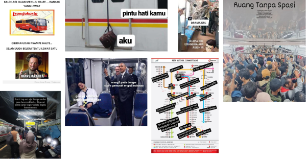
The Context

Jakarta's public transportation network is vast—Transjakarta, Commuterline, MRT, LRT—all serving millions of commuters daily. In 2019 alone, the Commuterline carried 900,000 passengers per day, while Transjakarta transported 735,000 passengers across all corridors.

But here's the problem: While these services exist, the experience of using them is fragmented. Want to travel from Jakarta to Bogor Botanical Gardens? You'll need to figure out which Commuterline to take, where to transfer, and how to connect to local transport—all while checking multiple apps and sources.

The core issue? Accessibility. Information is scattered, routes are unclear, and planning multi-modal journeys feels like detective work.

🌳 Breaking Down the Problem

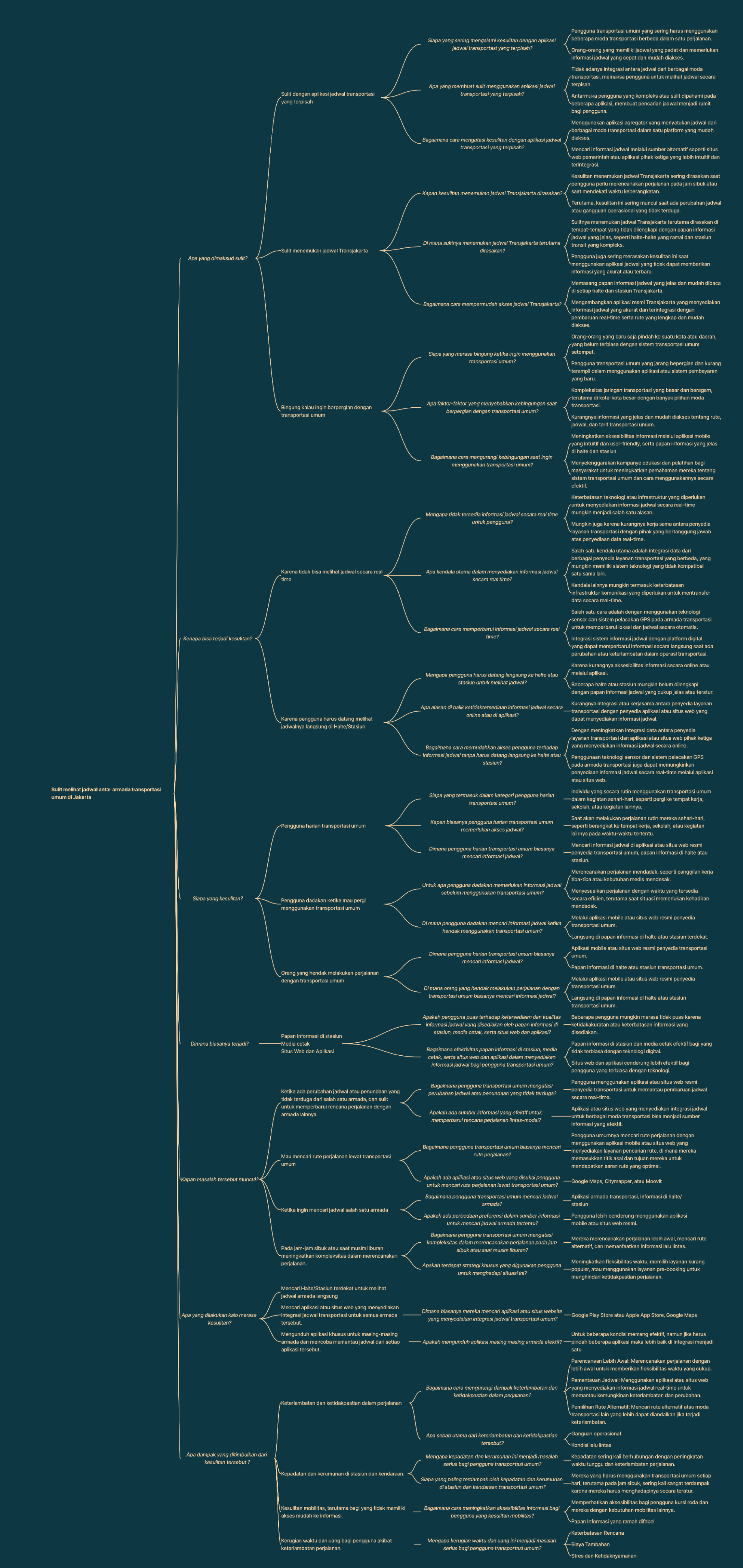
To tackle this challenge systematically, I used an Issue Tree framework. Starting with one core problem statement, I broke it down into smaller, actionable insights:

"How can we help users easily see schedules across different transportation services?"

Issue Tree - Problem breakdown analysis

💬 Understanding Real Users

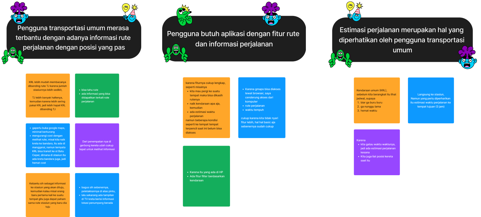
Nothing beats talking to real people. I sat down with actual commuters—students, workers, regular users of Jakarta's public transport—and listened. Their frustrations, their workarounds, their daily struggles.

These conversations revealed patterns that data alone couldn't show. Here's what I discovered:

🔄 User Behaviors & Pain Points
  • →The Queue Problem: Many commuters skip checking schedules, leading to long waits and overcrowding at stops
  • →The App-Switching Hassle: Users juggle multiple apps to plan multi-modal trips—exhausting and error-prone
  • →Time Wasted: Without schedule visibility, commuters lose precious time waiting or taking inefficient routes
👥 Research Participants
  • ✓ Women and Men
  • ✓ 3 Participants
  • ✓ Aged 17 - 40
  • ✓ Residing in Jabodetabek
  • ✓ Students & Workers
  • ✓ Active transit users

📊 From Research to Design Principles

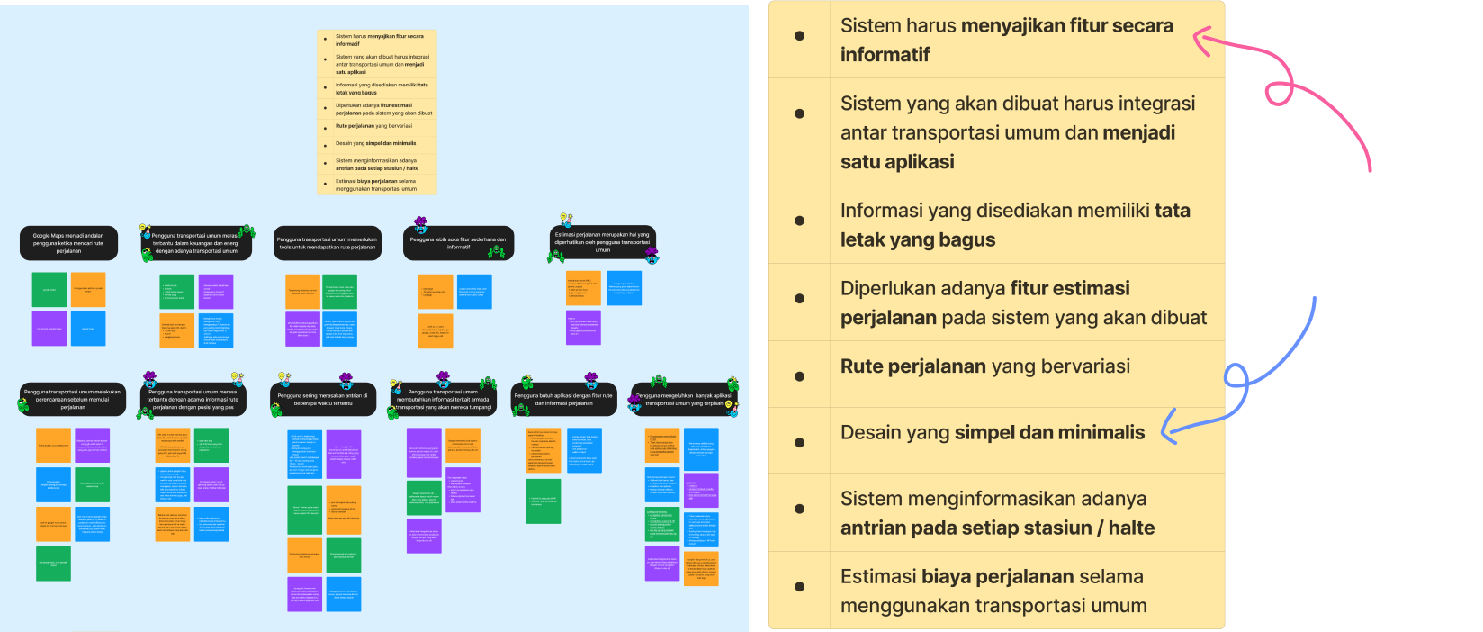
Raw research data is overwhelming. So I organized interview responses into clear patterns, then transformed those patterns into design mandates—actionable principles that would guide every design decision moving forward.

Think of it as translating "user frustrations" into "design opportunities."

User response grouping analysis
Design mandates from research

Separating Problems from Insights

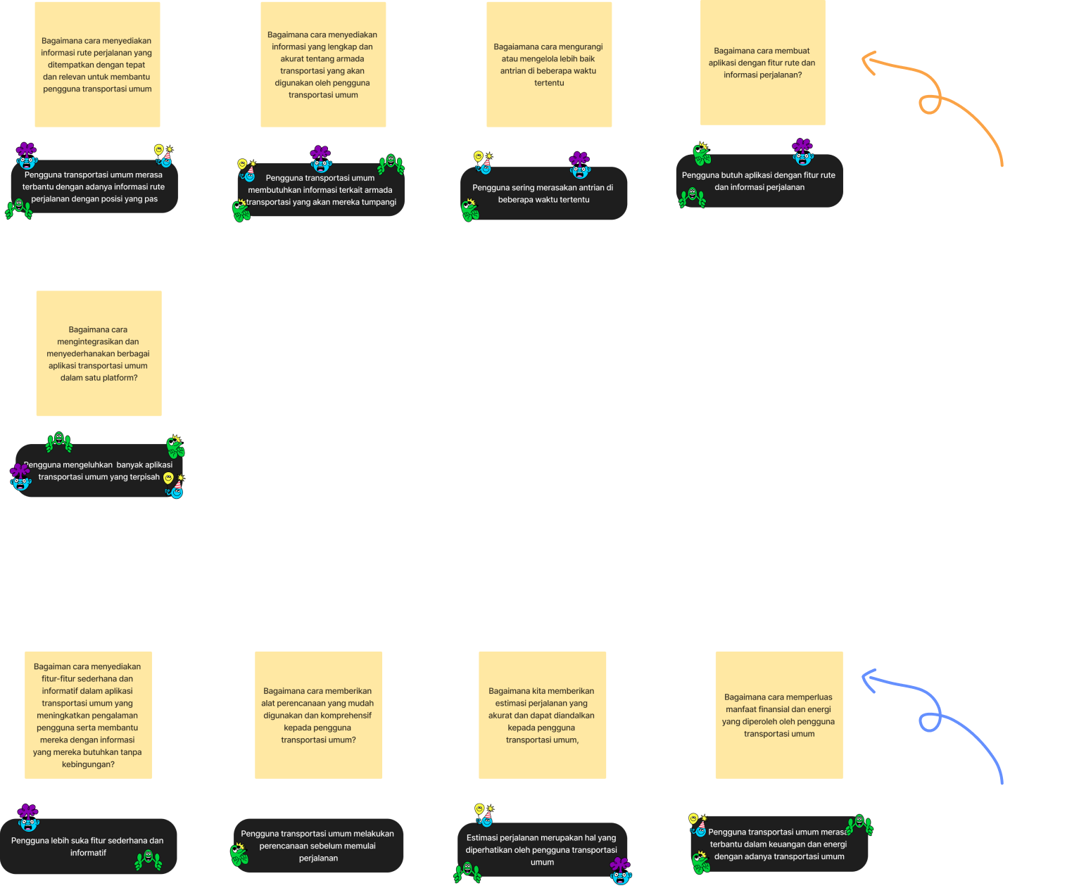
With patterns identified, I separated them into two categories:

🚨

Problems

Issues users face daily—these become "How Might We" questions

Example: "Too many separate apps" → "How might we unify the experience?"

💡

Insights

User desires and expectations—these guide our features

Example: Users want simplicity, time estimates, and cost-effective routing

This framework ensured every feature we'd design would solve a real problem or fulfill an actual need.

Problems and insights categorization

✏️ Sketching the Solution

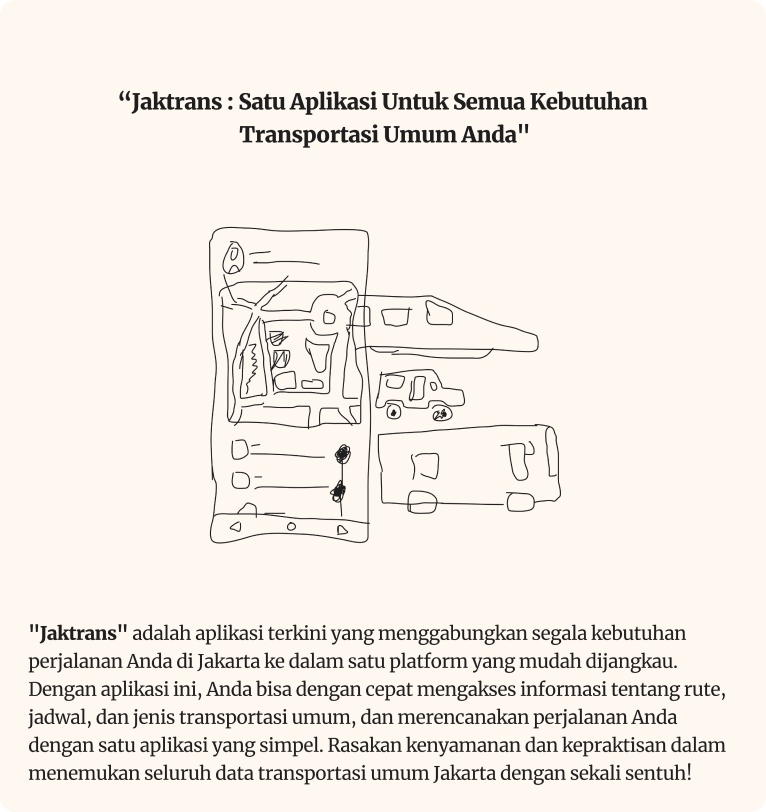
With research insights in hand, I grabbed a pen and started sketching. No fancy tools yet—just raw ideas flowing from user needs to potential solutions. What would an app look like if it truly understood a commuter's journey?

Users needed: Easy route access • Clear schedules • Multiple transport options • Journey planning

Initial concept sketches

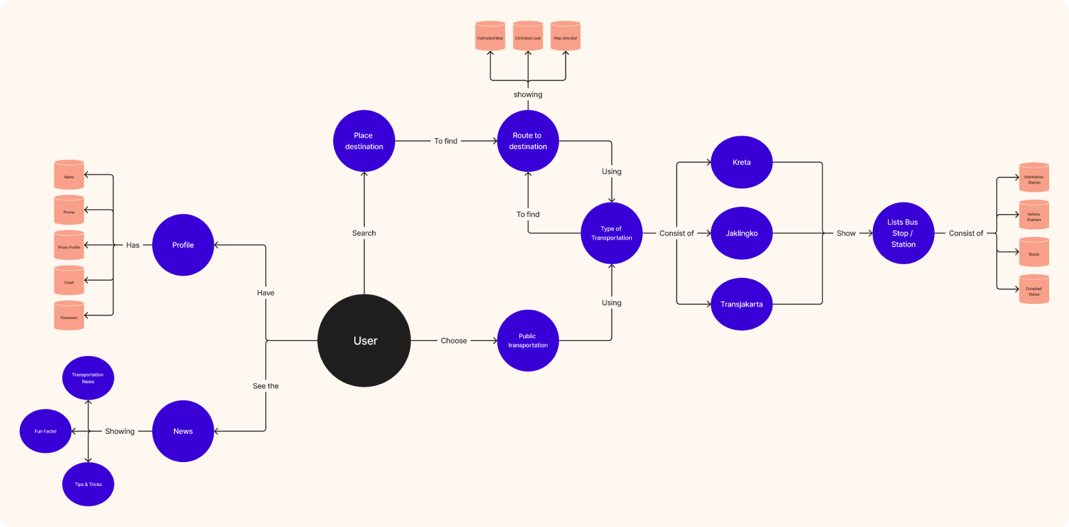
Building the Concept Model

The Concept Model is where ideas become structure. It maps out:

  • →What the app will do (functionality)
  • →What features it will include
  • →How users will interact with it

Think of it as the blueprint before construction begins—a shared vision everyone can understand.

Comprehensive concept model diagram

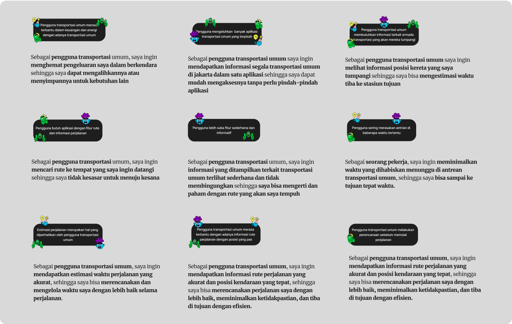
🎯 Jobs To Be Done: Walking in Their Shoes

Here's a powerful shift in perspective: Instead of asking "What features do users want?", I asked "What job are users trying to accomplish?" This is the essence of the Jobs To Be Done (JTBD) framework.

The Real Job:

"When I need to get from point A to point B using public transport, I want to know my options, timing, and connections—all in one place—so I can arrive on time without stress or confusion."

By stepping into users' shoes, I could design for outcomes, not just features.

Jobs To Be Done framework analysis

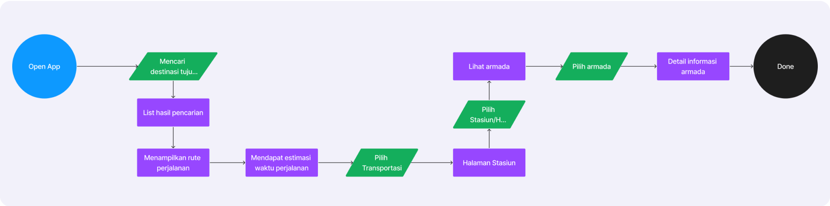
🗺️ Mapping the User Journey

Now came the critical part: designing how users would actually move through the app. Every tap, every screen, every decision point needed to feel natural and effortless.

I mapped out the user flow from the moment someone opens JakTrans to the moment they confidently board their transport. No dead ends. No confusion. Just clarity.

The Flow Priority:

Open app → See nearby routes → Check schedules → Plan journey → Get real-time updates → Arrive confidently

Complete user flow diagram
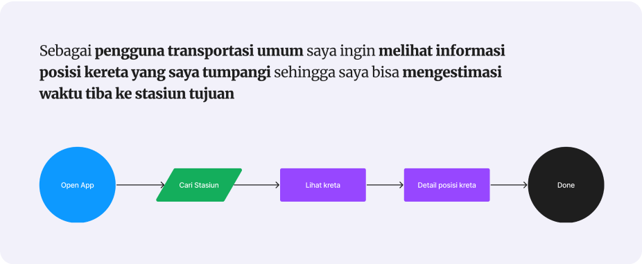
User flow based on JTBD framework

JTBD Meets User Flow

This flow isn't just about screens—it's about jobs completed. Using insights from the Jobs To Be Done framework, every step addresses a real user goal:

  • ✓Finding the right transport mode
  • ✓Understanding timing and connections
  • ✓Getting from A to B without anxiety

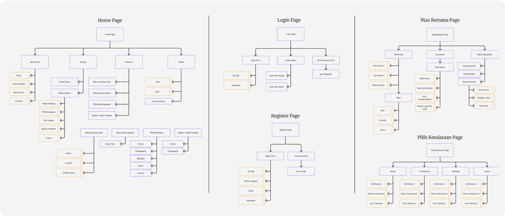
🏗️ Information Architecture (IA)

With the flow defined, I needed to structure the information itself. Information Architecture is the invisible scaffolding that makes navigation feel intuitive—users shouldn't have to think about where to find things; they should just find them.

Information architecture structure

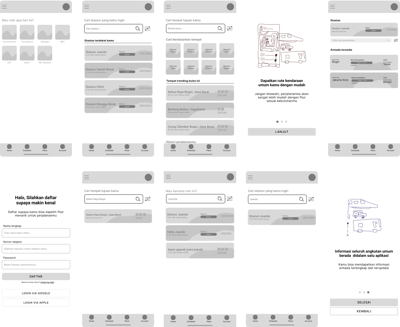
📐 Wireframing: Structure Before Style

With the architecture in place, it was time to bring ideas to life—without the distraction of colors, fonts, or fancy graphics. Wireframes are the skeleton of the design, showing structure and layout without visual polish.

Key Goals:

  • → Unified interface (no more app-switching)
  • → Real-time updates visible at a glance
  • → Trip planning tools accessible in seconds
  • → Clear hierarchy guiding users naturally

These wireframes translate research, flows, and architecture into tangible screens—the first glimpse of what JakTrans would become.

Low-fidelity wireframes showing app structure

Why Wireframes Matter

Wireframes let us focus on functionality before aesthetics. By aligning closely with prioritized features and user needs, we could validate the layout and interaction patterns early—saving time and ensuring the foundation was solid before adding visual design.

Think of it as building the frame of a house before choosing paint colors.

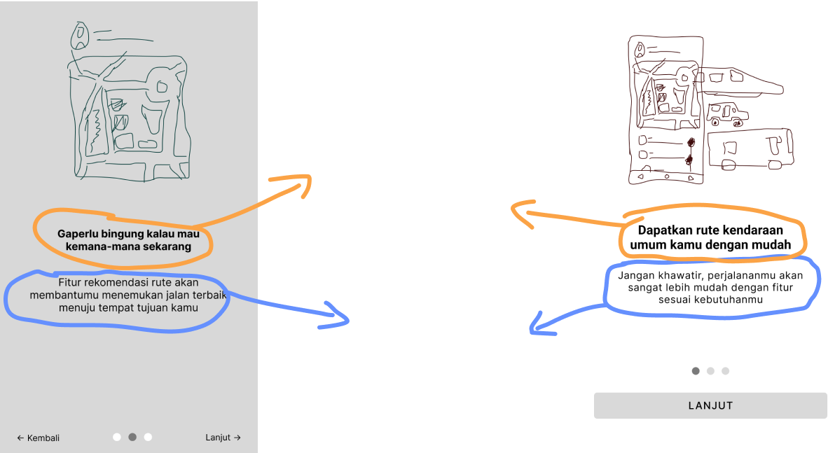
💬 Finding the Right Voice

Design isn't just visual—it's also how we speak to users. Words matter. The right tone can make users feel guided and confident, while the wrong tone can create confusion or frustration.

JakTrans' Tone of Voice:

✨

Clear

🤝

Formal

💙

Respectful

🎉

Enthusiastic

This tone builds trust and reliability while staying approachable—guiding users without overwhelming them.

Tone of voice guidelines and examples

🎨 Setting the Visual Mood

Before diving into colors and typography, I created a moodboard—a visual collection that captures the feeling and aesthetic JakTrans should evoke. Not just "what it looks like," but "how it makes you feel."

Mood Goals:

✓ Reliable & trustworthy

✓ Modern & efficient

✓ Calm & clear

✓ Accessible & friendly

This moodboard became our north star—keeping the entire visual design cohesive and intentional.

Visual moodboard with design inspiration

🎨 Bringing It to Life: The UI Design

This is where everything comes together. After research, wireframes, and planning—now comes the visual magic. But here's the thing: great UI isn't about looking pretty. It's about making complexity feel simple.

Design Philosophy:

"Clean, uncluttered, and instantly understandable—users should focus on their journey, not on figuring out the app."

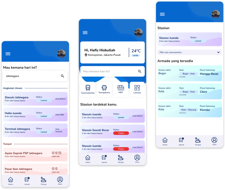
High-fidelity UI design samples

Why Clean Design Wins

When users open JakTrans, they're usually in a hurry—rushing to catch a bus, checking if they'll make their connection. The last thing they need is visual clutter. Clean design means:

  • →Instant clarity — critical info at a glance
  • →Intuitive navigation — no hunting for features
  • →Reduced cognitive load — less thinking, more doing

🧩 Design Elements

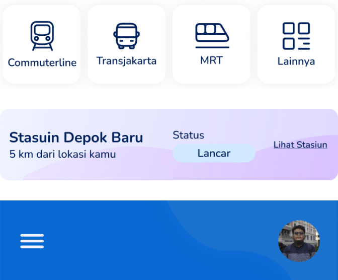
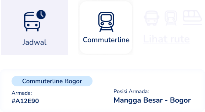
UI design elements and components

Every button, icon, and component was designed with purpose. Simple doesn't mean boring—it means intentional.

  • ✓Clear affordances (buttons look clickable)
  • ✓Consistent patterns (learn once, use everywhere)
  • ✓Minimal visual noise (focus on what matters)

The result? Users accomplish their goals faster and with confidence.

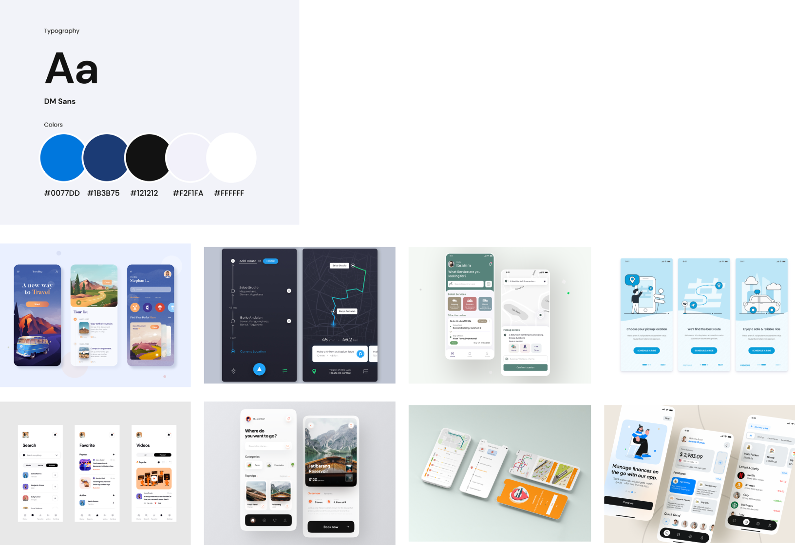
Style Guide
style_guide
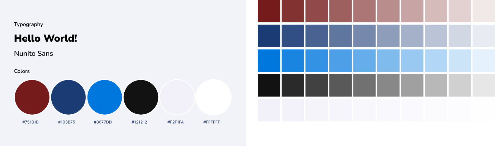
A style guide serves as a reference document that outlines the visual and branding guidelines to maintain consistency across the application. This includes defining margins, padding, grid systems, and component sizing to ensure a harmonious visual hierarchy and user interface.
The style guide will encompass various aspects of the application's design, including typography, color palette, iconography, spacing, and layout. Each element will be carefully selected to reflect the desired aesthetic and mood established earlier in the process, aligning with the needs and preferences of public transportation users.
pallete
The color palette will incorporate colors that evoke reliability, efficiency, and user-friendliness, as identified in the mood board. Iconography will be intuitive and universally understood, aiding navigation and communication of key concepts.
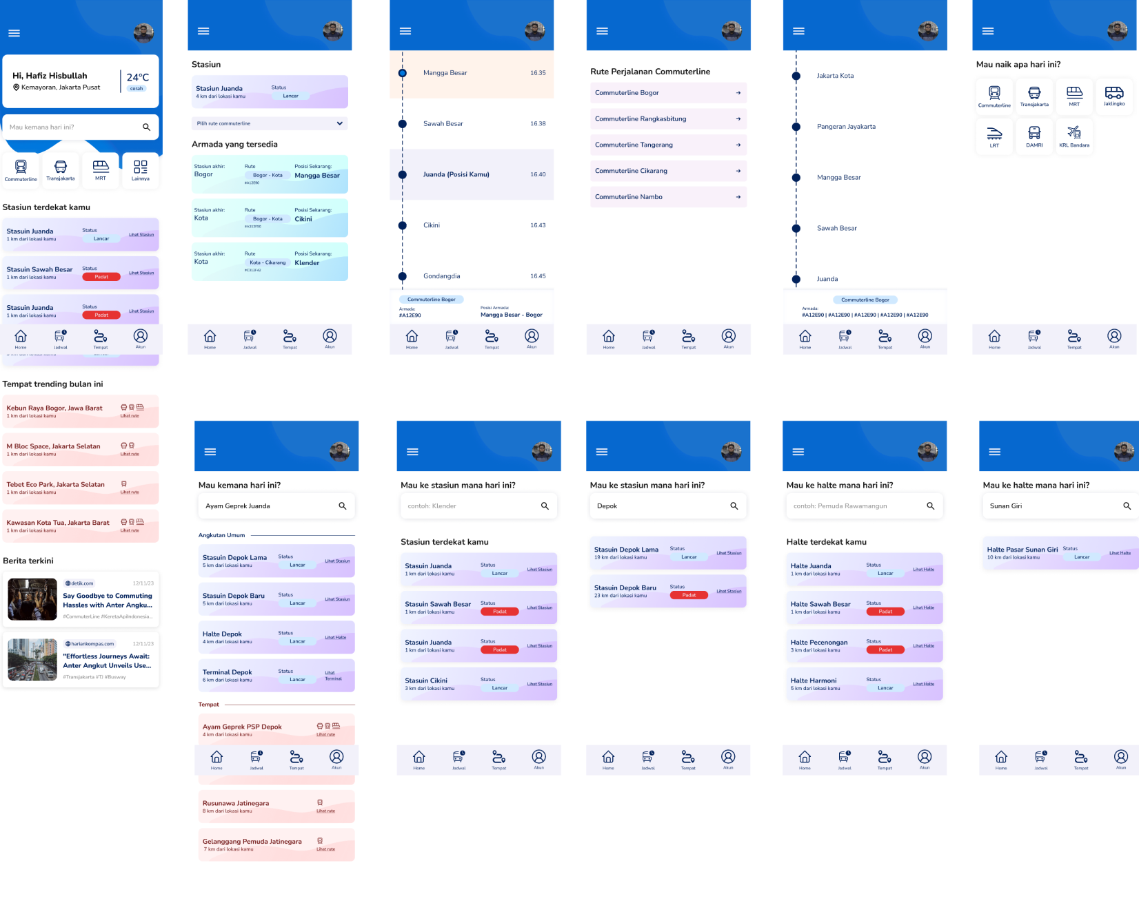
Complete UI design showcase

"From scattered frustration to unified clarity—JakTrans transforms how Jakarta commutes."

🧪 Testing with Real Users

Design is never finished until real users have tried it. No matter how thoughtful the research or polished the design, usability testing reveals the truth—what works, what confuses, what delights.

Why Fresh Eyes Matter:

I deliberately chose participants who weren't part of the initial research. Fresh perspectives prevent confirmation bias and uncover issues that familiar users might overlook. Different expectations = different insights.

This phase turned assumptions into evidence—validating what worked and exposing what needed refinement.

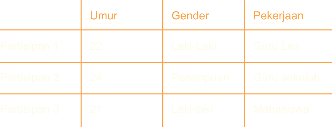
👥 Who Tested JakTrans

I recruited three participants aged 21-25—millennials actively using Jakarta's public transportation. This demographic represents a significant user segment: tech-savvy, time-conscious, and familiar with mobile apps for everyday tasks.

Perfect candidates to stress-test JakTrans in real-world scenarios.

Usability testing participant profiles

📊 What We Discovered

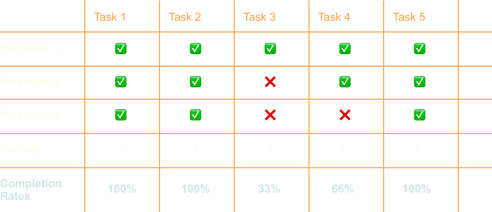
During testing sessions, I observed everything: task completion times, points of confusion, moments of delight, and user comments. Each interaction became data—both quantitative (how long?) and qualitative (how did it feel?).

Analysis Framework:

  • • Task performance observation
  • • Difficulty identification
  • • Completion time tracking
  • • User feedback capture (strengths & weaknesses)
Usability testing results and findings
Testing conclusions and insights
✅ What Worked
"Overall, the app is pretty good. I could choose the transportation I wanted, find the nearest station, and—most importantly—see where the train was at that moment. That real-time tracking was a game-changer."

— Test Participant

⚠️ What Needs Work
"The estimated arrival time is crucial—I need to know when the train will reach my station. Also, the search bar saying 'Where to today?' is confusing. If I type 'Bogor,' I expect to see all transport options to Bogor, not just stations named Bogor."

— Test Participant

Key Learnings:

  • ✓ Real-time tracking was the standout feature
  • ✓ Arrival time estimates need more prominence
  • ✓ Search functionality requires clearer expectations

🚀 Key Takeaways & Future Vision

What I Learned

This project taught me that great UX isn't about adding features—it's about removing friction. Jakarta's commuters don't need another app; they need one app that understands their journey from start to finish.

Through empathetic research, strategic design decisions, and iterative testing, JakTrans evolved into more than just a transportation app. It became a tool for confidence—helping people navigate the city with clarity, not confusion.

🎯

User-Centric

Every decision rooted in real user needs and behaviors

✨

Simplicity First

Complex systems, simple interface—that's the goal

🔄

Continuous Iteration

Learning from users and improving with every update

The journey doesn't end here. As Jakarta's transportation evolves, so will JakTrans—always listening, always improving, always serving the diverse community that depends on it.

Muhammad Hafiz Hisbullah
Hi, i'm
Muhammad Hafiz HIsbullah 👋
Product Design || Frontend Developer
Let's Connect!